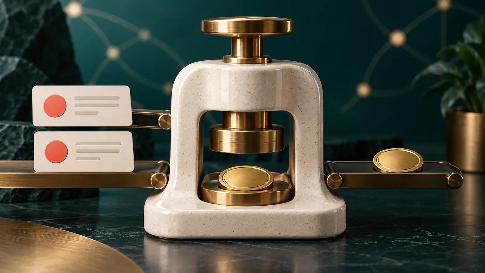

Three screens contain three slightly different primary buttons. One has a loading state, another uses a different focus treatment, and the third becomes unreadable when its label wraps. The team does not have a creativity problem. It has repeated decisions that were never shared.
A design system can begin by collecting those decisions. It does not need a large launch event or a complete library before it becomes useful.
Audit the interface that already exists
Look for recurring buttons, inputs, cards, dialogs, navigation patterns and status messages. Group examples by purpose. Similar appearance does not always mean two components perform the same job.
Ask which variations are intentional. A destructive action may need a distinct treatment, while two ordinary submit buttons may differ only because they were built at different times. Keep the meaningful differences and resolve accidental ones.
Define behavior alongside appearance
A component includes more than its default screenshot. Document what it does while loading, when disabled, after an error and when content is unusually long. Include keyboard behavior and focus handling where the interaction needs them.
For a dialog, decide how it opens, how it closes and where the user returns afterward. For a form field, define the label, supporting instruction and validation message. These rules help the implementation remain consistent as the product grows.
Use shared values where they reduce repeated work
Colors, spacing, type sizes and border treatments can be expressed as shared values in design and code. Choose names that describe their role, such as primary action or muted text, rather than making every page choose a new shade.
Keep the system understandable. A small product may need a modest set of values and a short component guide. Excessive abstraction can make ordinary changes harder when the team has to navigate several layers to adjust a simple pattern.
Give the library a maintenance process
Someone needs to review changes that affect shared components. Explain how a team member proposes a new variant, how it is evaluated and how existing screens receive the update.
Keep examples close to the implementation where practical. Documentation that shows behavior from an old version can create more confusion than missing documentation. Include a clear indication when a component is being replaced.
Start where repetition is expensive
Choose a few components used across important journeys and improve them first. A dependable input, button, dialog and feedback message can carry a surprising amount of product work.
- Inventory repeated patterns in current screens.
- Agree which differences serve a real purpose.
- Document states, content rules and interaction behavior.
- Assign ownership for shared changes.
- Apply the components to a real feature and review the result.
The system earns its maintenance cost when teams can make common decisions once and use them reliably. Let the product's recurring needs set the pace of the library.