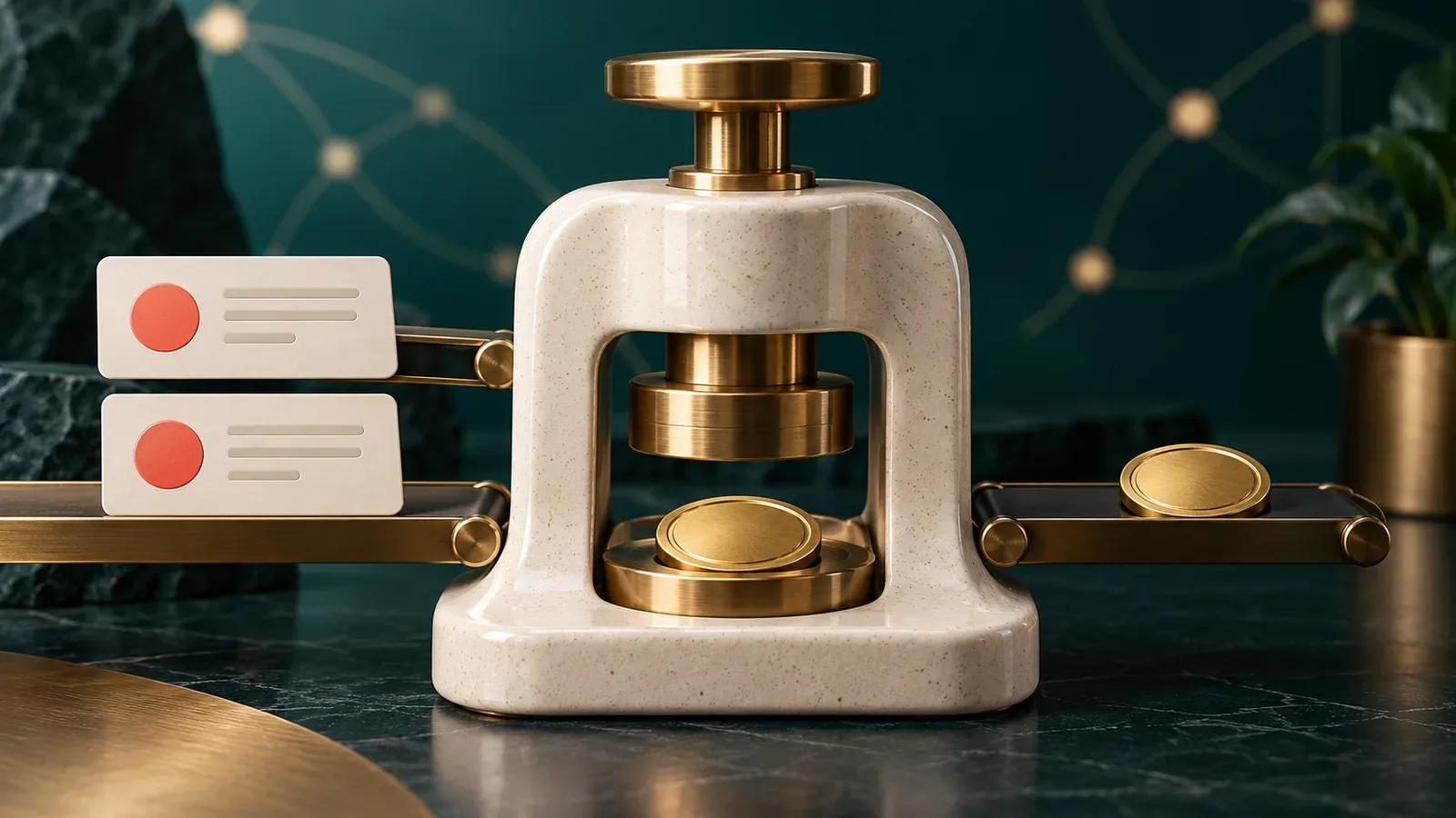
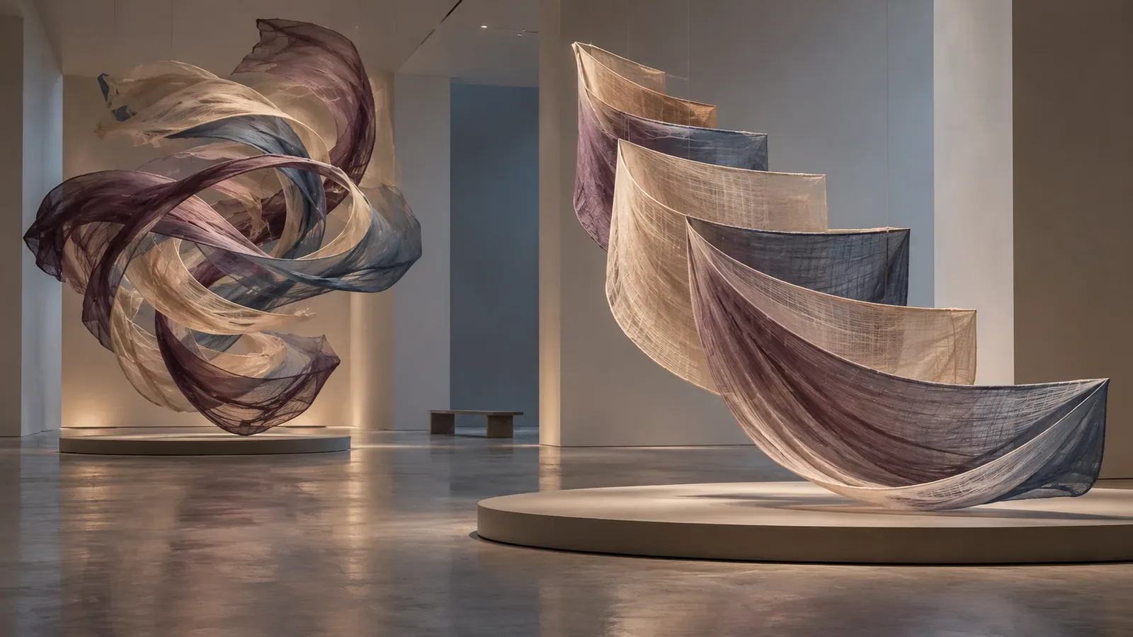
Animation can explain hierarchy, confirm an action or simply decorate a page. Large zooms, parallax movement and continuous panning can also cause discomfort for people with vestibular motion sensitivity. Reduced motion design does not mean deleting every transition. It means identifying what movement communicates, then providing a calmer way to communicate the same state when the user has requested it.
Consider a finance dashboard that zooms from an overview card into a full report. Under reduced motion, the route can change through a brief cross-fade while headings and focus make the new context clear. The information remains; the spatial flight does not.
Audit motion by purpose and trigger
List entrance animation, route transitions, scrolling effects, progress indicators, auto-playing media and interaction feedback. Note the area of the screen that moves, distance, speed, repetition and whether the user starts it. Large-scale scaling and panning deserve particular attention. Classify each effect as informative, supportive or decorative.
Ask what would be lost if the object changed instantly. A loading indicator conveys ongoing work, but it does not need a sweeping full-screen animation. A chart transition may show which series changed, yet labels and highlights can communicate the same update with less movement.
Use the preference as an adaptation signal
The prefers-reduced-motion media feature detects an operating-system preference for minimizing non-essential motion. Put calmer overrides after the default rules or design from a low-motion base and add enhanced movement only when appropriate. Test specificity so a component-level animation does not accidentally override the preference.
Avoid setting every duration to zero without review. Instant changes can remove orientation cues, and some JavaScript animation libraries need an explicit branch. Replace a long slide with a short fade, a scale with a color or border change, and continuous decorative motion with a static composition.
Preserve progress and state meaning
A reduced progress indicator still needs to show that work continues. Use restrained opacity pulses, a textual status or a determinate bar when progress is known. For carousels and data visualizations, stop automatic movement and let the user initiate changes. Keep pause controls available even when the operating-system preference is not set.
When motion carries a spatial relationship, reinforce it with headings, breadcrumbs, focus placement and persistent labels. The calm version should not feel like a broken version. It should be a deliberately composed interaction with the same task outcome.
Test preference changes and real journeys
Enable reduced motion before loading the application, then change the system preference while it is open. Check route transitions, modals, menus, charts and loading states. Verify that animations do not continue off-screen, that focus remains visible and that removing motion has not created abrupt layout shifts.
MDN describes the media feature and the kinds of movement that may trigger discomfort. Pair that technical switch with a product review of purpose. A respectful interface treats motion as an enhancement whose intensity can change, not as the only language available for explaining what happened.
For related delivery support, explore 4Minds Technology's UI, UX and product design and web development. A useful implementation should leave the operating rule, evidence and ownership clear enough for the next team member to maintain. Record the final decision beside the system so future changes can be reviewed against the original purpose.